PRSA Website Redesign
PRSA's website is an important tool for delivering value to members, so it is essential that PRSA effectively directs members to the website and consistently meets their expectations. According to feedback from members, it can be difficult to find what they need on the website due to its text-heavy pages, which are not suitable for visual scanning and are even harder to read on mobile devices.
The redesigned website offers more intuitive navigation and is focused on helping visitors complete their key tasks. The updated content strategy also emphasizes the visual appeal and readability of the content. The new website was developed using responsive design, ensuring a high-quality experience on any device.
Here’s What I Did:
Simplified homepage
Most of the site visitors were unfamiliar with PRSA and were just learning about the association. That's why I focused on delivering a highly visual story of PRSA's mission and key values to introduce people to the organization. The new homepage welcomes prospects to the membership experience with:
Images of real members to make them feel welcome and included
An explanation of PRSA's mission and goals
Calls to action to help guide users to the next step
Simplified navigation
A clean aesthetic with high-contrast colors.
Homepage mosaic
The homepage mosaic is a way for prospective members to get to know the heart of PRSA - its members. The mosaic features professional and student members at Chapter networking events, professional development programs, and other PRSA events. Every time a user visits the homepage, the images will be refreshed, so they can meet new members.
Mobile accessibility
The new PRSA site uses responsive design to ensure that all web pages and templates can be easily read on smartphones, and other devices. All copy has been crafted and organized in a way that is easy to consume on these devices.
Taxonomy and search
To improve search functionality, I implemented a faceted search and an organizational taxonomy. All content, events, programs, and products were classified according to a unified structure.
Search results are categorized, allowing users to refine their search by topic and type (e.g. documents, events, professional development, articles). This new classification system helps PRSA identify and present the information that their visitors are most interested in seeing.
Results
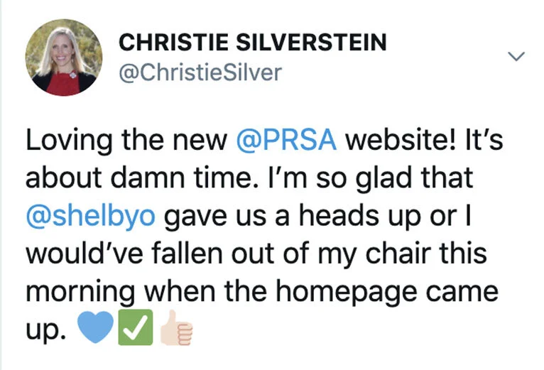
“Loving the new PRSA website. I’m so glad..for the heads up or I would’ve fallen out of my chair this morning.”
— Christie Silverstein
Promotional Video
This video was displayed at PRSA’s national conference as the website launched.
Video design by Kelli Collins and Crystal Szabo


